This blog is no longer being used by me.
BUT on a positive note a beautiful and fun packed new one is now up and running on my website.
Click here to see

Embrace every brief. visit: www.jennycairns.com
11/07/2011
17/06/2011
Final Hand In

Final hand in for Camberwell College of Arts.
I set my logo for this series of projects in Headline Bold in letterpress, then after taking a long time to work out what paper to use, chose colorplan 540gsm in various colours. This is made up in the Lakes and technically you can get any colour you want made, it is basically two layers of paper meshed together to gain this weight. I chose this weight as when letterpressing I could then deboss and it would not effect the other side of the paper. also this weight is sturdy and great to use as a file.
Each file as a different project within it. Some are dvds and others printed material.


Fleeting Phrases | Final Posters

Final Posters, finished & ready for selling!
Fluro colours were the best choice.
SRA2 posters to be sold at:
10/05/2011
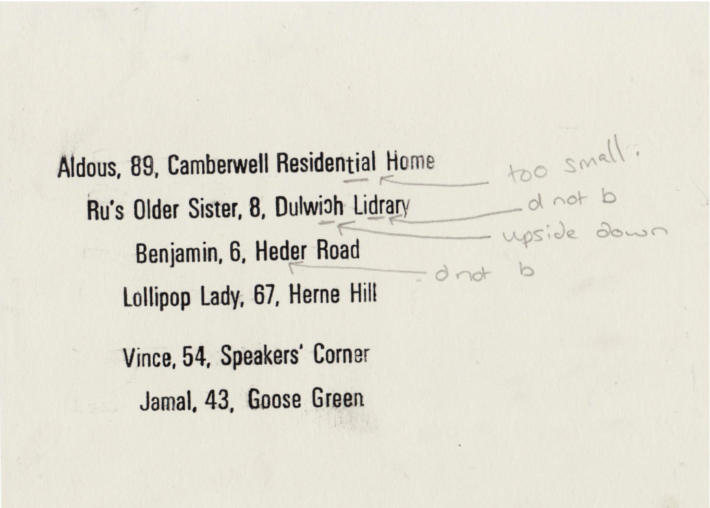
Fleeting Phrases| mind your b's & d's
06/05/2011
Fleeting Phrases| Poster Development
 I have spent the last 2 days, a total of 12 hours letterpressing, a bit of back ache, a lot of giggles and some useful bits of knowledge have been gathered along the way too. But they are finished I have printed both the silver ink, along the left hand side and the pantone black ink in the centre (roughly- looked better slightly off centre thanks to the silver being on the left hand side, when centred literally using a ruler, didn't physically look centred, balanced this by adding a few mm along). Due to luckily prior thinking through of the task I was able to set up a slot for the type to go in each time I was printing different posters, making this a lot quicker and easier process. (worth the effort to space appropriately in advance). Still need to buy frames for these to go in to for the exhibition, but that will get done soon. It is now time to more on to how to package these when sold- which I am almost finished doing, using bright colours (specifically fluro) to keep this theme throughout.
Subscribe to:
Posts (Atom)